Knowledge Stop: Using the Right Fonts in Email Design
Email Marketing | Mobile Marketing | Graphic & Information Design

When I talk to HighRoad clients about options for their beautiful, mobile-friendly email templates, one of the first things that comes up is font choice. Marketers want to use the typography that's in their brand guidelines. They want unique fonts & design -- something that sets them apart from the deluge of email we all get.
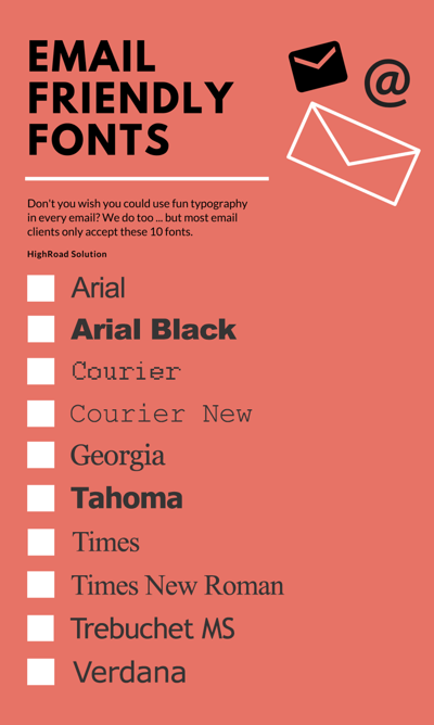
This is where I have to be a buzzkill and remind them of something our CEO, Ron, jokes about often: When you're dealing with email design and coding, we're still coding like it's 1999. While general website design has improved leaps and bounds since the mid-90s, email hasn't come quite as far. You need to take into account the fact that your message will be seen across many email clients and platforms, and most platforms only have universal support for about 10 fonts: Arial, Arial Black, Courier, Courier New, Georgia, Tahoma, Times, Times New Roman, Trebuchet MS and Verdana.

pssst! I made this infographic using Canva, which I've talked about before in Knowledge Stop. Check it out.
These are fonts that almost all computers have installed, so it's a safe bet that your email will look good in almost all inboxes. That said, your template designer should always have a fallback font written into your code; if not, and your computer doesn't have the font indicated, it will default to whatever your computer's settings indicate. This isn't always a big deal, but when you're trying to use a sans serif font and your computer defaults to a serif like Times New Roman, you may not be pleased.
Other options are available if you want to get more daring with your fonts, but there's no guarantee they'll work. To get experimental, look into Google Web Fonts.
If you can't stomach the idea of using old-school Tahoma as a header font, you can always use images instead of text (as in, images with text on them). However, that's got its own dangers: if someone opens your email and doesn't load the text images, will they even understand what the email is about? What's more important - graphic design or the message you're trying to get across? Weigh these options before you choose.
Speaking of email design, did you know we're running a fall special? Get your discounted, responsive template designs today.


